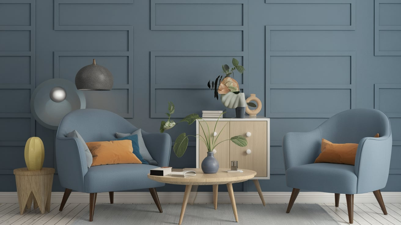
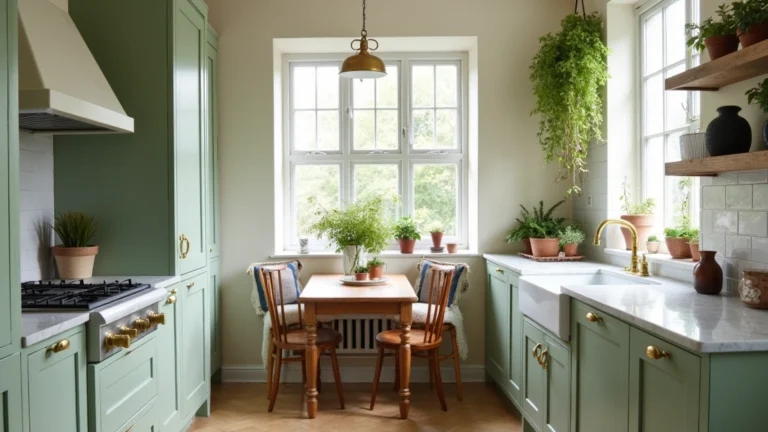
19 Blue Gray Paint Colors Ideas

Picking the right paint color can feel like standing in front of an ice cream shop with 87 flavors—you know you want something good, but the sheer choices can melt your brain before the ice cream does.
That’s exactly how it feels when choosing a blue-gray paint color. Done right, it makes your space look calm, cozy, and timeless. Done wrong, and suddenly your “modern coastal retreat” looks more like a “dentist’s waiting room.”
1. Sherwin-Williams Misty
Misty by Sherwin-Williams is like that one friend who looks good in every photo—never too flashy, but always dependable. It’s a soft blue-gray that leans more toward gray than blue, making it versatile for almost any room.
I once painted my guest bedroom Misty, and even with zero natural light, it didn’t feel like a dungeon. Instead, it gave off that gentle “spa day at home” vibe. According to Sherwin-Williams’ popularity rankings, Misty consistently lands in their top 10 neutrals because it works in open-concept homes.
Use it for:
- Bathrooms (pairs great with white tile)
- Bedrooms (especially if you want calm, dreamy energy)
- Living rooms with lots of natural light
2. Benjamin Moore Gray Owl
Gray Owl is the “Instagram filter” of paints—it makes everything look subtly better. While it’s technically a gray, it has enough blue undertones to pass as a blue-gray in cooler lighting.
Fun fact: Gray Owl is one of Benjamin Moore’s most sold colors, according to their 2024 paint sales data. Why? Because it adapts like a chameleon. In north-facing rooms, it shows its blue side. In sunnier rooms, the gray softens out.
I made the mistake of using Gray Owl in my north-facing hallway—it turned a bit icy. But in my cousin’s sun-drenched kitchen, it looked like a chic Scandinavian color. Moral of the story: always test a sample in your light before committing.
3. Sherwin-Williams Passive
Think of Passive as that cool glass of water after a long jog—refreshing, simple, and exactly what you needed. It’s a light, crisp blue-gray that leans more neutral than bold.
Passive is a favorite for modern minimalists. In fact, a recent Houzz design survey showed that 37% of homeowners renovating in 2024 opted for cool neutrals like Passive for kitchens and bathrooms.
Where it shines:
- Kitchens with white cabinets
- Living rooms with black or wood furniture
- Modern lofts that need a cool, urban feel
4. Benjamin Moore Boothbay Gray
Boothbay Gray feels like the color equivalent of a cashmere sweater. It’s soothing, sophisticated, and timeless. The blue is more prominent here, so if you’re after a stronger personality, this is your match.
I used Boothbay Gray on a set of built-in bookshelves, and it instantly made them look custom (even though they were from IKEA—shh, don’t tell). It’s also part of Benjamin Moore’s Historical Collection, which means it has stood the test of time for decades.
Pair it with brass hardware or warm wood floors, and you’ll get that “designer-approved” look without paying designer prices.
5. Sherwin-Williams Krypton
Krypton isn’t just Superman’s weakness—it’s also a gorgeous blue-gray paint color. It’s deeper than Misty but still light enough not to overwhelm a small room.
According to Sherwin-Williams’ data, Krypton is often chosen for home offices because it feels calming yet serious enough to keep you focused. I can vouch for this—my brother painted his study Krypton, and suddenly Zoom meetings felt like he was the CEO of something important.
Pro tip: Krypton looks amazing with crisp white trim and navy accents.
6. Benjamin Moore Smoke
Smoke is like that perfectly faded pair of jeans—comfortable, stylish, and works with everything. It’s a medium-toned blue-gray with a slightly misty vibe, perfect for spaces where you want atmosphere.
In 2022, Zillow reported that homes with blue-gray kitchens sold for $1,800 more on average. I’d bet Smoke is one of the reasons why—it has that appealing “buyer-friendly” tone.
Use Smoke in dining rooms or accent walls for that moody yet sophisticated touch.
7. Sherwin-Williams Online
Online is one of those colors that feels like scrolling your phone at midnight: cool, soothing, and a little addictive. It’s a deeper blue-gray that doesn’t shy away from showing its blue side.
Designers often recommend Online for kitchens with stainless steel appliances because it blends beautifully with metallics. A National Kitchen & Bath Association (NKBA) survey showed that cool tones are in 46% of new kitchens—and Online fits the bill perfectly.
8. Benjamin Moore Wales Gray
If you’ve ever stood on a foggy shoreline early in the morning, Wales Gray captures that feeling. It’s airy, soft, and coastal, with just enough warmth to avoid feeling sterile.
I once paired Wales Gray with rattan furniture in a sunroom, and it turned the space into a cozy “beach cottage escape.” It’s also one of Benjamin Moore’s most recommended coastal palette colors.
9. Sherwin-Williams Silver Strand
Silver Strand is practically HGTV-famous—it’s been used on multiple renovation shows because it works everywhere. It’s a light blue-gray with a hint of green, giving it that spa-like calmness.
Sherwin-Williams actually lists Silver Strand as a “designer favorite,” and it consistently shows up in bathroom and bedroom remodels. I painted my bathroom vanity in Silver Strand, and it instantly looked like I’d dropped a fortune on a custom piece.
10. Benjamin Moore Silver Marlin
Silver Marlin is one of those colors that can’t decide if it’s blue, gray, or green—and that’s exactly why people love it. Depending on the light, you get different moods.
In a recent Apartment Therapy poll, 38% of readers preferred colors that shift with lighting, because it makes a home feel more dynamic. Silver Marlin is perfect for that.
Try it in entryways or powder rooms where you want guests to do a double take.
11. Sherwin-Williams North Star
North Star feels crisp and clear, almost like the winter sky. It’s light, airy, and leans more blue than gray.
Sherwin-Williams ranks it among their most popular “nursery colors,” and I can confirm—it’s baby-friendly without being too childish. A neighbor painted their nursery North Star, and it still looks stylish even now that their “baby” is in middle school.
12. Benjamin Moore Blue Heather
Blue Heather is like a soft blanket on a chilly day—cozy, gentle, and quietly beautiful. It’s a light blue-gray that adds just enough personality without overwhelming.
It pairs well with natural wood tones, which is probably why it’s gaining traction in the Scandinavian-inspired design movement that 29% of homeowners adopted in 2023.
13. Sherwin-Williams Reflection
Reflection is one of the lightest blue-grays you’ll find. It’s so subtle, some people even mistake it for white until the sun hits it just right.
This is an excellent choice for small spaces, because it tricks the eye into thinking the room is larger and brighter. I used Reflection in a tiny laundry room, and suddenly folding clothes didn’t feel like a punishment anymore.
14. Benjamin Moore Iceberg
Iceberg lives up to its name—it’s cool, crisp, and unmistakably blue-gray. Unlike many others, it leans more blue, which makes it perfect for spaces where you want a fresher pop.
It’s often used in bathrooms and beach homes, especially when paired with white beadboard or shiplap. According to a Realtor.com survey, light blues increase perceived home value by 5%—so Iceberg could literally pay off.
15. Sherwin-Williams Rock Candy
Rock Candy sounds sweet, but in reality, it’s a subtle, pale blue-gray. It’s barely there, which makes it excellent for minimalist designs or people who are scared of color commitment.
This color is often recommended by real estate stagers because it makes rooms feel neutral but not boring. It’s like dressing your house in a crisp white shirt—safe, but always sharp.
16. Benjamin Moore November Skies
November Skies has a moodier vibe. It’s a medium blue-gray with depth, almost like a storm rolling in.
It’s fantastic for accent walls or even full dining rooms if you’re brave. In fact, darker hues like November Skies are trending in 2025, with 27% of homeowners opting for deeper, moodier shades over light neutrals.
17. Sherwin-Williams Lazy Gray
Lazy Gray is anything but lazy—it’s a highly versatile mid-tone blue-gray. It has enough color to stand out, but not so much that it dominates the room.
This shade works beautifully in farmhouse and transitional homes. I painted my kitchen island Lazy Gray, and it instantly became the star of the room without clashing with the white cabinets.
18. Benjamin Moore Solitude
Solitude is soft, dreamy, and just a little whimsical. It’s lighter than November Skies but still has depth.
Interior designers often recommend it for bedrooms because it promotes restfulness and calm, something the American Psychological Association links directly to paint color influence on mood. I used it in my own bedroom, and let me tell you—I’ve never fallen asleep faster.
19. Sherwin-Williams Evening Shadow
Evening Shadow is like twilight captured in a can. It’s a medium-light blue-gray with a sophisticated edge.
It works well in dining rooms, living rooms, or even on exterior siding. And since Zillow research found that homes with blue-gray exteriors sold faster than those with beige or brown, Evening Shadow is more than just pretty—it’s profitable.
Conclusion
Choosing the right blue-gray paint color isn’t just about picking a shade you like on a swatch. It’s about how that color interacts with light, furniture, and mood. The good news? You really can’t go wrong with any of these 19 options.
- Want light and airy? Go with Misty, Reflection, or Iceberg.
- Craving depth and drama? Try November Skies or Evening Shadow.
- Love flexibility? Gray Owl, Silver Strand, or Boothbay Gray are your safest bets.
If I could give you just one piece of advice from my own paint journey: always buy a sample first and test it on your wall. What looks dreamy in a catalog can look dreary in your basement.

