24 Living Room Gallery Wall Ideas
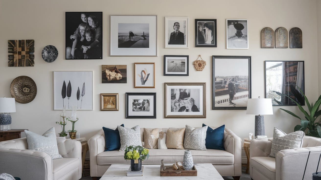
If your living room walls feel like blank canvases silently screaming for personality, then a gallery wall might just be your secret weapon.
But here’s the catch: most gallery walls on Pinterest look like they came straight out of the same cookie-cutter playbook. Identical frames, predictable layouts, and prints you’ve seen a million times.
1. Mix Vintage and Modern Frames
A gallery wall feels far richer when the frames themselves have stories. Instead of buying twelve identical frames, try mixing a mid-century wood frame you scored at a flea market with a slick black aluminum frame from IKEA. The contrast feels intentional, like your collection grew over time.
When I started my first gallery wall, I realized my grandmother’s ornate gold frame added warmth that no store-bought set could replicate. Layering those histories into your wall makes it feel lived-in, not staged.
2. Go Beyond Just Art Prints
Most gallery walls end up as poster graveyards. You can instantly make yours unique by adding unexpected elements: a woven basket, a small mirror, a ceramic plate, or even a vintage clock. Studies show that homeowners who incorporate mixed media in their décor tend to perceive their space as more creative and inviting (Houzz survey, 2023).
Your wall becomes less of an art store knockoff and more of a three-dimensional storybook.
3. Incorporate Personal Photography
Let’s be honest—your phone is bursting with gorgeous moments that deserve better than digital limbo. Print them out. A gallery wall with family photos, travel shots, or even candids of friends feels intimate and soulful.
Pro tip: print them in black-and-white if you’re worried about clashing colors. That way, the collection feels cohesive but still personal.
4. Play With Different Sizes
Cliché gallery walls often suffer from being too symmetrical. Instead, layer in different sizes—large statement pieces mixed with small, quirky ones. Designers often follow the “anchor and accent” rule: choose one large focal piece, then build around it with supporting works.
This prevents the dreaded “doctor’s office art wall” vibe.
5. Use a Gallery Ledge Instead of Nails
Hate committing to nail holes? Enter: the gallery ledge. These thin wall shelves let you lean frames, swap them out, and layer pieces in front of each other. It’s perfect for people like me who get décor ADD and love refreshing the look every few months.
Ledges also let your gallery wall evolve, which keeps it feeling collected instead of frozen in time.
6. Add Sculptural Elements
Think beyond the flat surface. Mount a mask, a woven wall hanging, or even a guitar. A mix of 2D and 3D pieces creates depth and keeps the eye moving.
When I added my old Polaroid camera to my gallery wall, it suddenly felt less like “art for art’s sake” and more like a personal museum exhibit.
7. Stick to a Cohesive Color Story
Here’s the truth: gallery walls can turn messy fast. The easiest way to prevent chaos is to pick a color palette—whether it’s warm neutrals, moody blacks and blues, or vibrant jewel tones.
According to design psychologists, cohesive color palettes reduce visual clutter and make rooms feel larger. Even if your pieces are wildly different, that thread of color ties everything together.
8. Use Grid Layouts for Modern Vibes
If you lean minimalist, go for a grid layout with evenly spaced frames. It’s structured, calming, and gives your living room a polished edge.
But here’s the trick: don’t fill it with generic prints. Instead, choose meaningful content—like architectural sketches from trips, or even abstract doodles you made during Zoom meetings. The structure keeps it sophisticated while the content keeps it personal.
9. Blend Store-Bought with Handmade
Balance is key. Sure, that trendy Etsy print is gorgeous, but balance it with something handmade: your child’s drawing, a pressed flower you framed, or a ticket stub collage.
Every gallery wall should have at least one piece that screams “you can’t buy this anywhere.” That’s what makes it collected.
10. Anchor with a Statement Piece
Every wall needs a star. Whether it’s a bold canvas, a vintage poster, or even a textile, choose one piece to be the anchor. Then build the smaller works around it.
Designers recommend at least one piece that’s 24 inches or larger to prevent the wall from looking like confetti.
11. Go Asymmetrical for Personality
Forget balance—embrace quirk. Asymmetrical layouts (where pieces cluster unevenly) feel organic and collected. They mimic how walls in old European homes evolve over decades.
It’s like cooking without a recipe—the result feels more authentic.
12. Add Typography Pieces
Words carry weight. A framed poem, a vintage sign, or even a funky neon phrase adds character. In fact, typography in interiors has surged—Pinterest reported a 45% increase in searches for “typographic art” last year.
It’s like whispering little reminders to yourself every day.
13. Layer Frames Over Wallpaper
If you’ve got wallpaper, don’t shy away from it—play with it. A floral backdrop with sleek frames creates instant dimension. Think of it like wearing jewelry with a patterned dress—the right balance makes it pop.
14. Embrace Negative Space
Not every inch needs to be covered. In fact, leaving breathing room between frames makes the collection feel more intentional. Overcrowding is the fastest way to tip from collected to chaotic.
I once made the mistake of cramming too much in. Stepping back, my wall looked like a thrift store exploded. Editing is your friend.
15. Go Vertical in Small Spaces
If your living room wall is narrow, use height to your advantage. Stack frames vertically to draw the eye upward and make ceilings look taller.
It’s a designer trick for apartments where square footage is scarce.
16. Highlight With Sconces
Lighting changes everything. Add a pair of wall sconces above your gallery wall to spotlight your pieces. Art museums do this for a reason—it instantly elevates the mood.
Plus, it looks way more intentional than just tossing frames up.
17. Curate Around a Theme
While random can be fun, sometimes a theme ties it all together. Think: botanical sketches, travel maps, family heirlooms, or abstract line art.
When guests see it, they’ll instantly recognize the narrative, making the wall feel purposeful instead of patchwork.
18. Use Floor-to-Ceiling Impact
Want drama? Take your gallery wall all the way up. Filling an entire wall from baseboard to crown molding creates a cocoon of art.
Research shows that larger displays make people spend more time visually engaging with a space (Journal of Environmental Psychology, 2022). That means your living room won’t just be passed through—it’ll be experienced.
19. Frame Unexpected Materials
Don’t just frame art—frame textiles, handwritten recipes, postcards, or even vinyl records. My favorite trick is framing a vintage scarf; it feels high-end but costs almost nothing.
These one-of-a-kind additions prevent your wall from feeling like a showroom.
20. Add Mirrors for Light
A small mirror tucked into the gallery wall not only breaks up the art but also reflects light and makes the space feel bigger.
Mirrors act like the witty friend at a party—they make everyone around them look better.
21. Showcase Travel Memories
Souvenirs often sit forgotten in boxes. Why not frame that subway ticket from Paris, the hand-painted tile from Lisbon, or the beach photo from Bali?
Your gallery wall becomes a living scrapbook—part décor, part memory lane.
22. Keep Frames Consistent, Art Eclectic
If you worry about visual chaos, flip the script: keep all your frames the same color and material, but go wild with the art. The uniform frames will anchor the variety, making even eclectic collections look curated.
23. Experiment With Layering
If you’ve got a console table or sofa against your wall, don’t just hang everything—layer frames on surfaces too. Leaning a piece against the wall feels casual and collected, like your home is always evolving.
24. Rotate Your Collection
Here’s the secret no one talks about: gallery walls don’t have to be permanent. Rotate art in and out with the seasons, or when you stumble across a new find. This keeps the wall fresh and dynamic, instead of stale and overdone.
Think of it like changing your wardrobe—it reflects who you are right now.
Conclusion
The difference between a collected gallery wall and a cliché one comes down to intention. Cliché walls chase trends; collected walls tell stories. They mix old and new, art and objects, perfection and imperfection.
When you curate your gallery wall with pieces that matter to you, it transforms from generic décor into a visual autobiography. And the best part? It never has to be finished. You can keep layering, swapping, and evolving it for years—because just like you, your wall has a story that’s still unfolding.