20 Moody Paint Colors Ideas
When it comes to home design, paint colors set the emotional stage for your space. A room can whisper calm or scream drama simply by the shade on the wall.
And while bright whites and neutrals will always have their place, 2025 is the year of moody, deep, soul-stirring colors. Think of them as the soundtrack to your home—full of rich notes and powerful undertones.
1. Midnight Navy
If a color could tuck you in at night, midnight navy would be it. This shade feels both dramatic and comforting. Picture the inky blue of the night sky right before the stars come out. It’s luxurious, grounded, and has a timeless depth.
Designers are loving it on accent walls, cabinetry, and bedrooms, where it feels cocoon-like without being too heavy. Pair it with brass accents, light oak wood, or cream upholstery to balance the depth.
Fun fact: Sherwin-Williams reports that dark blues saw a 24% increase in sales last year, and 2025 projections keep this trend climbing.
2. Charcoal Black
Charcoal black is like your favorite leather jacket—edgy but still approachable. Unlike stark black, charcoal has a softer, smoky undertone, making it feel rich and cozy instead of harsh.
I once painted my home office in a charcoal shade, and suddenly, every bookshelf and art piece looked curated, almost like a gallery. It’s one of those colors that makes everything else pop.
3. Deep Olive Green
Deep olive is earthy, moody, and a little mysterious. It feels rooted in nature but carries a sophisticated edge. When you pair it with gold frames, plush fabrics, and warm lighting, it transforms into an old-world charm that feels fresh again in 2025.
Green shades have been steadily climbing in popularity—Benjamin Moore noted a 30% uptick in green paint sales between 2022 and 2024, and olive tones are leading the way this year.
4. Aubergine Purple
Aubergine, the shade of a glossy eggplant, brings a sultry energy into interiors. It’s bold without screaming for attention. Use it in dining rooms or cozy lounges where you want people to feel enveloped.
The best thing about aubergine? It plays well with metallics—gold, brass, or even silver accessories shimmer beautifully against it.
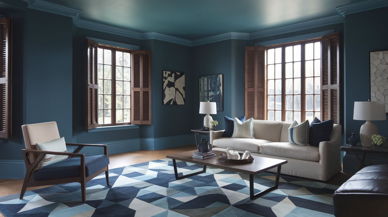
5. Stormy Gray
Stormy gray sits between a soft slate and a dramatic charcoal. Think of storm clouds gathering before rain. This color sets the mood in modern kitchens and living rooms, creating a sleek, urban atmosphere.
To keep it from feeling too cold, layer with warm textures—like velvet throw pillows, woven rugs, and soft wood finishes.
6. Burgundy Wine
Burgundy is the perfect marriage of red’s boldness and purple’s richness. It’s passionate, elegant, and very much a power color. In 2025, burgundy is being used heavily in dining spaces and home bars, creating moody, intimate settings.
Pro tip: This shade looks incredible with candlelight.
7. Smoky Teal
Smoky teal is for the color-lover who doesn’t want to go too bright. It’s a blue-green base muted with a touch of gray. In 2025, it’s showing up in bathrooms, kitchens, and offices as a creative yet calming hue.
Fun story: I painted a bathroom smoky teal once, and suddenly my five-minute showers turned into spa sessions. The color had this grounding energy that made me want to stay.
8. Espresso Brown
Espresso isn’t just for coffee anymore—it’s a powerhouse paint color. Deep browns are making a comeback in 2025, bringing warmth and grounded sophistication. Espresso walls in a living room paired with cream accents? Instant elegance.
The National Kitchen and Bath Association (NKBA) even noted a 19% rise in requests for dark brown cabinetry last year, and the wave is still growing.
9. Forest Green
Forest green is bold, organic, and instantly calming. It feels like bringing the outdoors inside, but with a moody, dramatic twist. Use it in a library, office, or even a bathroom for a luxury-meets-nature vibe.
Pair it with vintage leather chairs and warm wood for a timeless, cozy atmosphere.
10. Slate Blue
Slate blue is one of those quietly confident colors. It’s cooler than smoky teal but warmer than stormy gray, striking a perfect balance. In bedrooms, slate blue brings serenity, while in kitchens, it feels crisp and fresh without being sterile.
Data shows homeowners are increasingly leaning into blue-gray shades, with searches for “slate paint colors” doubling between 2023 and 2025.
11. Maroon Red
Maroon has that regal, classic look that feels grounded in tradition but still packs plenty of drama. In 2025, it’s being used in entryways and dining rooms to create strong first impressions.
Maroon pairs best with neutral trim and warm metallics. It feels moody but never gloomy.
12. Pewter Gray
Unlike stormy gray, pewter leans into warmer undertones, making it versatile and welcoming. It’s moody but not overpowering, which is why designers are using it as a neutral alternative to beige this year.
Pro tip: It’s one of the best shades to use if you’re nervous about going too dark but still want moody vibes.
13. Ink Black
Ink black is sharper than charcoal and unapologetically bold. This color is for those who aren’t afraid to make a statement. In 2025, ink black is being used in modern kitchens, bathrooms, and exterior trims.
Surprisingly, black-painted exteriors have seen a 35% rise in demand across U.S. neighborhoods, making it one of the boldest curb appeal moves right now.
14. Dusty Plum
Dusty plum blends purple, gray, and a touch of brown, resulting in a muted yet sophisticated color. It’s perfect for bedrooms, dressing rooms, or home offices where you want just enough drama without being too loud.
It pairs beautifully with creamy whites and soft gold accents.
15. Graphite Gray
Graphite is deeper than pewter but not as dark as charcoal. It’s a versatile shade that looks striking on kitchen cabinets or accent walls. Think of it as the Swiss Army knife of moody colors—it works almost anywhere.
Graphite’s popularity surged after several major paint companies added it to their “Color of the Year” palettes in 2024, and it hasn’t slowed down in 2025.
16. Cobalt Blue
Cobalt isn’t new, but it’s gaining moody appeal in 2025 thanks to its deep, jewel-like tone. It’s less casual than navy, bringing more vibrancy to spaces without losing the richness.
Cobalt makes a statement in bathrooms, front doors, or as bold accent walls. For maximum drama, pair it with crisp white trim or brass details.
17. Burnt Umber
Burnt umber is earthy, grounded, and full of warmth. It’s basically the color equivalent of sitting by a fireplace with a blanket. Designers are using it in living rooms, libraries, and kitchens to create welcoming yet dramatic spaces.
18. Ash Gray
Ash gray is softer than graphite but carries enough depth to still feel moody. It works wonderfully in bedrooms and bathrooms for those who crave a quiet, restful environment.
It’s also a fantastic backdrop for colorful artwork or patterned textiles because it won’t steal the show.
19. Wine Plum
Wine plum is like burgundy’s flirtatious sibling—it has a touch more purple, making it richer and moodier. It’s especially popular in luxury dining rooms and master bedrooms in 2025.
The romantic quality of this color makes it perfect for creating spaces that feel indulgent.
20. Onyx Black
Onyx is the boldest of the bold. Unlike ink black, which feels sleek, onyx has a slightly warmer undertone that gives it more depth. It’s showing up in exterior siding, modern kitchens, and even bathrooms for ultra-dramatic results.
The key with onyx? Balance. Use it with lighter floors or furniture to prevent it from overwhelming a space.
Conclusion On 20 Moody Paint Colors Ideas of 2025
The beauty of moody paint colors in 2025 is that they don’t just cover your walls—they transform the way your home feels. Whether it’s the comforting depth of midnight navy, the earthy richness of burnt umber, or the bold drama of onyx black, these shades are about creating atmosphere, personality, and presence.
If you’re tired of safe whites and grays, it might be time to embrace the darker side of the palette. These 20 moody paint colors aren’t fleeting trends—they’re timeless choices that bring your home character and emotional depth. And trust me, once you’ve lived with a moody color, going back to plain white walls feels like listening to music without bass.